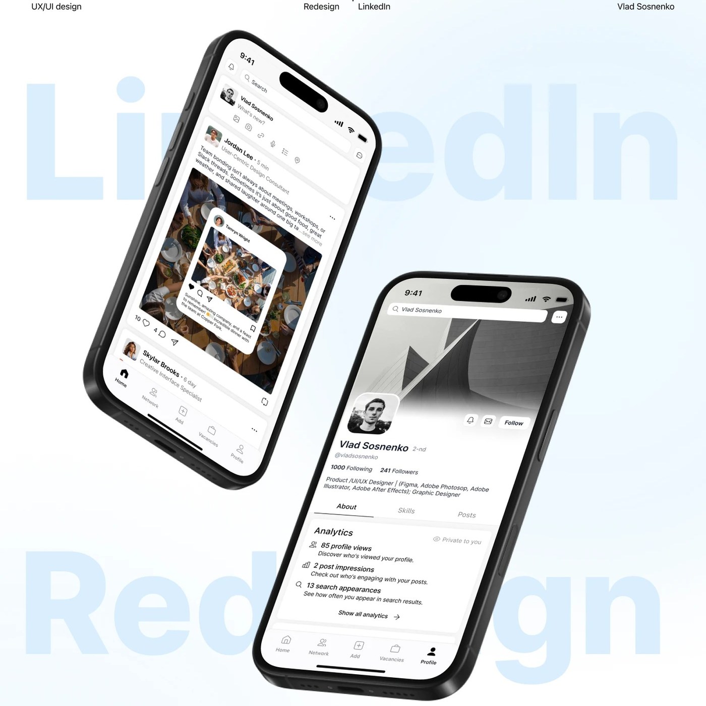
A comprehensive UI/UX design concept reimagining LinkedIn's web interface and dashboard experience reshapes the user experience through a modern and minimalist approach. Prepared by designer Vlad Sosnenko, this conceptual study aims to present the data-heavy structure of professional networking platforms with a simpler, more accessible, and aesthetic hierarchy.
Key Features of the New Interface
This redesign study specifically reduces information clutter, enabling users to focus more quickly on their main feed and metrics. In contrast to the often complex structure of the traditional LinkedIn interface, the new concept incorporates the following core UX improvements:
- Minimalist Dashboard Layout: Modular cards that allow users to view their profile performance, engagements, and network activity at a glance.
- Advanced Visual Hierarchy: Optimized use of typography and whitespace to reduce eye strain and enhance readability.
- Fluid Navigation: A flexible menu layout offering much more intuitive transitions to frequently used tools and the messaging panel.
Industry Implications
Concept studies of this nature continue to serve as a source of inspiration for digital product designers and the UX teams of major platforms. A growing trend toward simplification is particularly evident in B2B-focused interfaces aimed at boosting user efficiency. Making complex dashboards user-friendly shortens navigation times on the platform while directly elevating the quality of digital interaction.
Frequently Asked Questions
Is this conceptual study an official LinkedIn update or an independent design?
No, this is not an official update; it is an independent UI/UX design concept study prepared by designer Vlad Sosnenko.
How do interface concepts of this kind influence the future designs of platforms?
Independent design concepts typically set industry trends and serve as a reference point for major tech companies as they analyze user feedback to guide their own interface updates.
*This news story has been prepared based on data published by Abduzeedo.
💬 Comments
No comments yet. Be the first!
You must be logged in to comment.
🔑 Log In