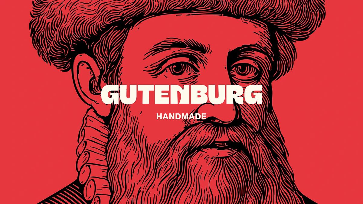
Gutenberg Design Studio has announced its new design project, which centers on typography and features compositions with high visual weight. This work introduces an innovative visual language that combines traditional print aesthetics with strong letterforms across modern digital platforms.
Key Design Details and Approach
The studio's latest project focuses on bold and dominant typographic forms aimed at maximizing visual impact without compromising readability. This concept—where minimalist backgrounds create a contrast with dense character sets—demonstrates that typography alone can serve as a powerful narrative tool, particularly in brand identity and digital art projects.
Industry Implications
In recent years, the digital design world has seen a growing interest in original, character-driven custom typography designs that go beyond standard serif or sans-serif fonts. Gutenberg Design Studio's work serves as an inspiring example for interface designers and branding experts, pushing the boundaries of typography in visual hierarchy.
Frequently Asked Questions
In which projects should heavy typography designs be preferred?
Such bold typographic approaches are generally effective in homepage banners requiring a strong brand stance, poster designs, and creative portfolio sites with minimal interfaces.
What should be considered in terms of user experience (UX) when using dense letterforms?
Large and bold fonts should only be used in headings or focal point areas, while standard and simple font families should be preferred for long text blocks to maintain readability.
*This news article was prepared based on data published by Abduzeedo.
💬 Comments
No comments yet. Be the first!
You must be logged in to comment.
🔑 Log In