
How Luxury Brands Must Reach Gen Z: The Codes of New-Generation Luxury
To effectively target Gen Z, luxury brands must move away from price-driven traditional status models and adopt new codes of luxury built on transparency, digital experiences, and cultural values. Research reveals that for young consumers, the concept of premium now gains meaning through accessibility and a sense of community.

HONOR Robot Phone Unveiled: Features and Price
HONOR has unveiled its new flagship, the Robot Phone, featuring a 2.6-gram motorized gimbal camera built into its body that can rotate 360 degrees. Powered by the Snapdragon 8 Elite Gen 5 processor, a 7,060 mAh battery, and the AI-driven YOYO Pro mode, the device starts at $1,482.

Where Does the Legendary Exhaust Sound of Harley-Davidson Motorcycles Come From?
The iconic idle sound of Harley-Davidson motorcycles stems from the uneven firing intervals of the cylinders in the brand's 45-degree V-Twin engine. The asymmetrical rhythm created by the exhaust pulses gives the engine its unique, deep, and choppy sound character.
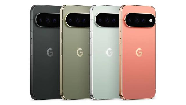
Google Pixel 11 Series Unveiled: Specs, Models, and Pricing
Google has officially announced its new Pixel 11 series, consisting of the Pixel 11, Pixel 11 Pro, and Pixel 11 Pro XL. Powered by the Tensor G6 processor and Android 17, the lineup has hit shelves with prices starting at $899.
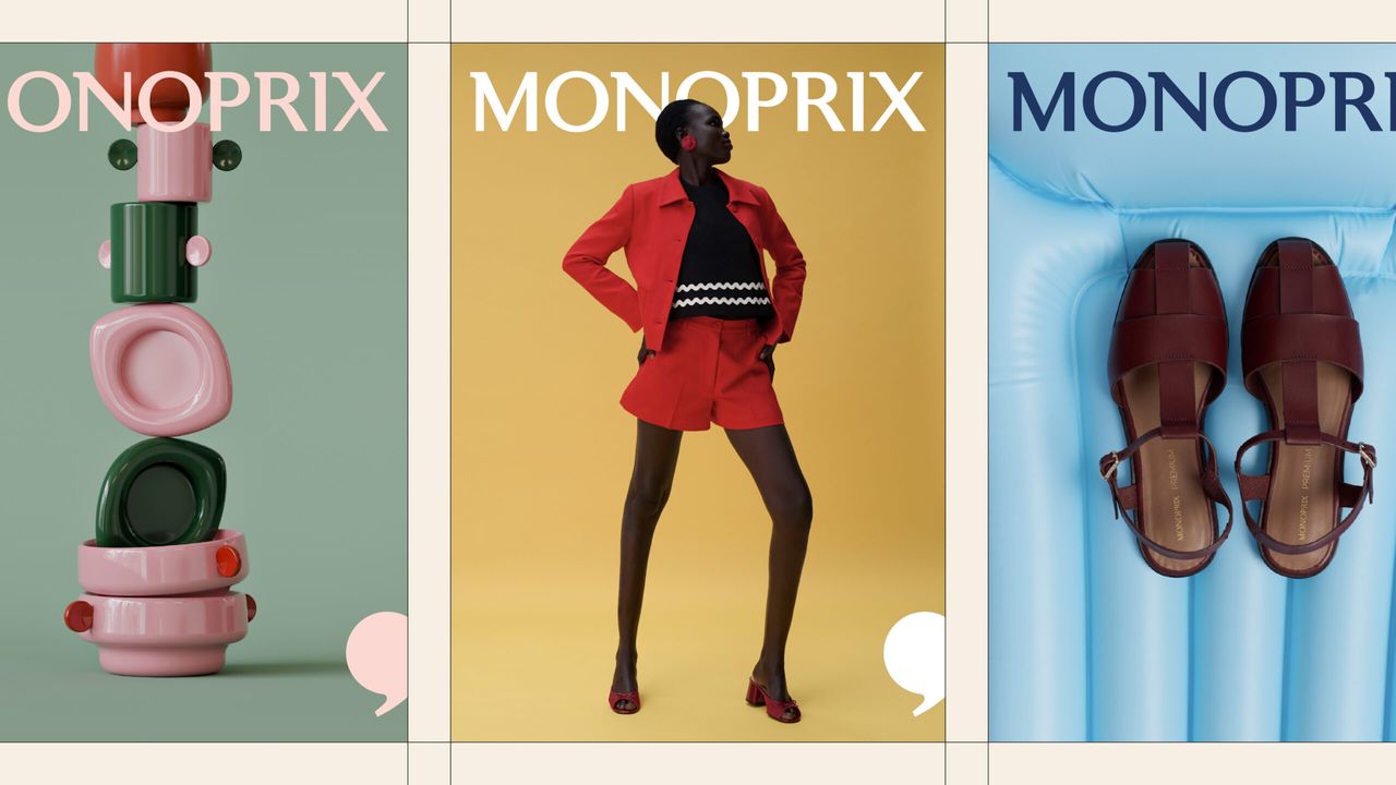
Why French Retail Giant Monoprix’s New Identity Is Being Praised as a Success
French retail giant Monoprix is turning heads with a new corporate identity project that bridges its rich heritage with modern design trends. Standing out with its minimalist and functional approach, this rebranding process boosts the brand's visibility both on digital channels and store shelves.
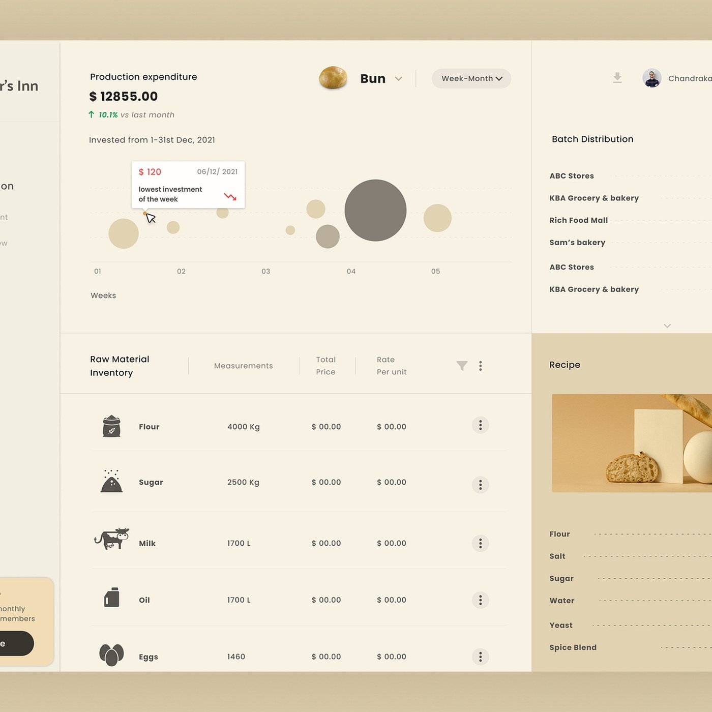
Bakker's Inn Dashboard UI Design: A Modern Interface and Data Visualization Example
Designed by Dnyanesh Maid, the Bakker's Inn dashboard interface offers a modern and user-friendly UI design that optimizes business management processes. Standing out with its minimalist data visualization elements and modular layout, this concept serves as a successful example where functionality meets aesthetics in interface design.

GRISO Architectural Branding and Identity System
The GRISO Architectural Branding and Identity System offers a comprehensive visual identity and design system for brands, characterized by minimalist and modern lines inspired by architectural forms. The project stands as a successful design example that bridges corporate identity with architectural aesthetics across digital and print platforms.
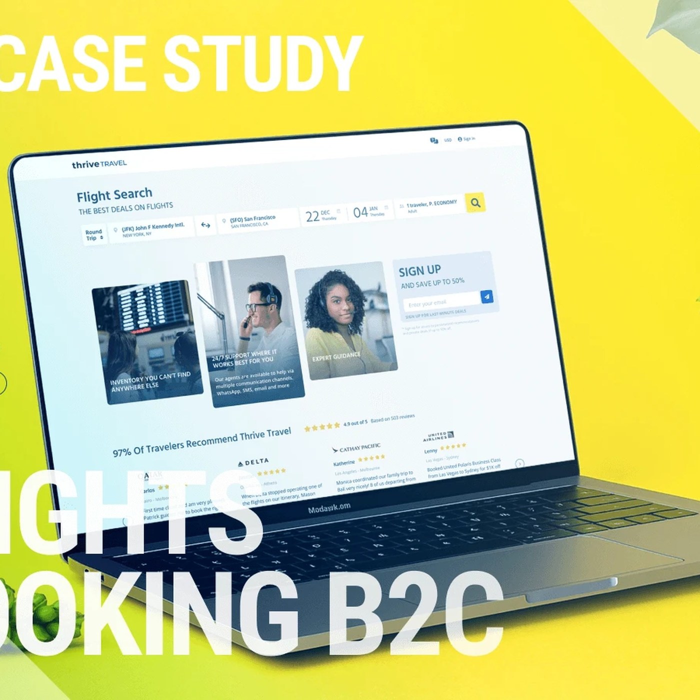
Thrive Travel Platform Interface Design: A UX Case Study by Roman Yashchenko
Designed by Roman Yashchenko, the Thrive Travel Platform is a standout UX case study that reshapes travel booking processes through a modern interface and a user-centric approach. Featuring a streamlined information architecture and a visually driven structure, the project offers inspiring solutions for the field of digital product design.

Does Disney's Controversial "Hexed" Logo Actually Follow Classical Animation Principles?
Disney’s controversial "Hexed" design proved its adherence to classical animation principles with the release of a detailed analysis. Contrary to initial criticisms, the project's underlying technical discipline and rules of motion have opened a new window for debate in the modern design world.
What the ArtStation and Sketchfab Acquisition Means for Digital Artists
The merger of the ArtStation and Sketchfab platforms creates an integrated ecosystem for digital artists, covering the entire process from ideation to 3D production. This move aims to allow creative professionals to manage their workflows from a single hub.

Lenovo’s MacBook Neo Rival, the IdeaPad Vibe, Leaked: Design and Specs
Lenovo's new laptop designed to rival the MacBook Neo, the Lenovo IdeaPad Vibe, has leaked. Expected to launch with vibrant colors, a Copilot key, a rich port selection, and both AMD and Snapdragon processor alternatives, the device aims to heat up competition in the budget-friendly segment.

Another Collective Crafts Minimalist and Striking Brand Identity for Elysium
The Elysium brand identity project, crafted by Another Collective, bridges minimalist design and modern aesthetics with digital marketing principles. This work serves as an inspiring example of how simple and functional solutions can be utilized to strengthen a brand's visual communication.
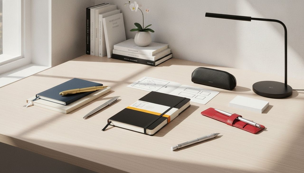
Luxury Design Trend in School and Office Stationery: Options Starting from $10
For those who do not want to pay high designer prices in the new school and office season, stylish and luxury-looking stationery products are being offered starting from $10. With their budget-friendly structures, these alternatives promise economical solutions for anyone wanting to create aesthetic workspaces.

Concept Artist Jin Lh’s Dark Fantasy World Created with ZBrush and Blender
Concept artist Jin Lh designs detailed digital characters and universes themed around dark fantasy and science fiction using ZBrush and Blender software. The artist's work attracts attention in the digital illustration world with its complex organic forms and original concepts.
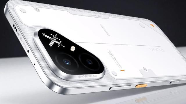
TECNO Pova 8 Pro Unveiled: Specs of the New Gaming-Centric Model
TECNO has unveiled its new gaming-focused smartphone, the Pova 8 Pro. The device stands out with its 144 Hz AMOLED display, Dimensity 7400 Ultimate processor, P1 graphics chip, 6,500 mAh battery, and a customizable Mini-LED screen on the back.
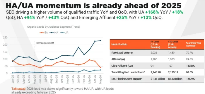
What Is Audience-First SEO and How to Apply It to Organic Traffic
Audience-First SEO is a strategic optimization approach that centers on high-value, revenue-driving audiences rather than broad, high-search-volume topics. By adapting the targeting discipline of paid media to organic search strategies, this method enables businesses to reach the right audience and boost their conversion rates.
Xiaomi Unveils HyperOS 4: Key Features and Release Date
Xiaomi's newly announced HyperOS 4 interface introduces features such as a glass design language, 18% faster app loading speeds, and Super AI Assistant 2.0. Drawing attention with camera optimizations and advanced customization options, the new version rolled out its first wave of beta testing on August 14.
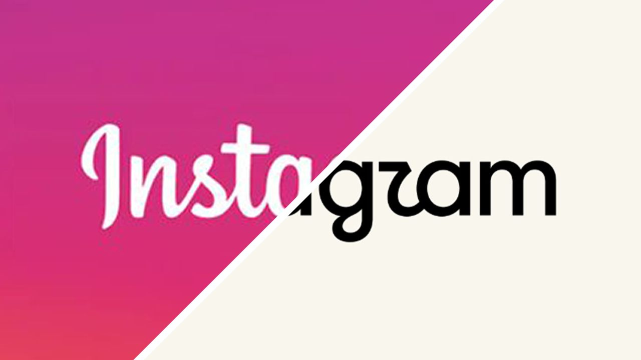
Why Is Instagram's New Logo Design Being Criticized?
Instagram has become the target of criticism from users and designers due to its recent logo design update. The fact that the change was driven by reasons other than aesthetic concerns has sparked a wave of shared dissatisfaction across the digital world.
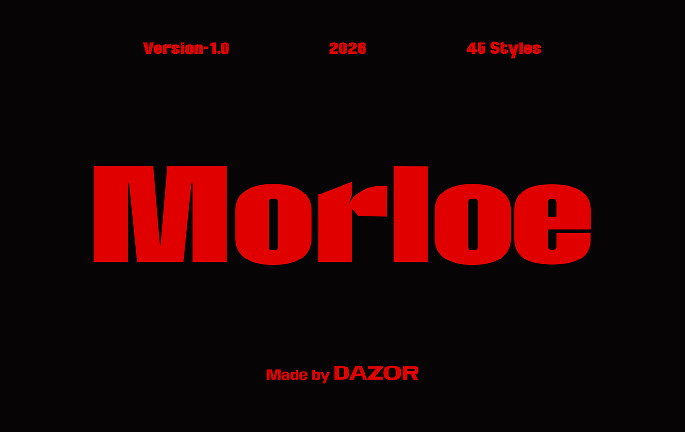
Morloe Variable Font: A Flexible Typography Solution for Modern Designs
Morloe is a new variable font that delivers typographic flexibility and performance in modern design projects. By offering multiple style variations through a single file, it provides designers with immense convenience across both digital and print work.
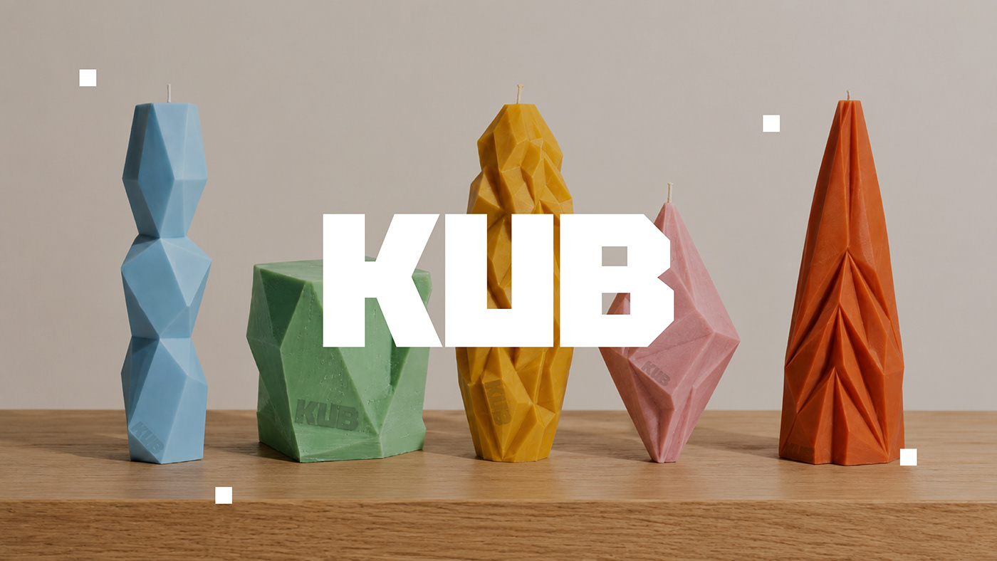
Taisia Vystavkina Crafts Minimalist and Modern Identity for KUB Candle
Taisia Vystavkina's brand identity design for Kub Candle stands out with its minimalist typography, calm color palette, and modern packaging details. The project highlights the power of a simple and consistent visual language in niche product marketing.

What Is Enterprise Marketing Automation? A Platform Guide for Large-Scale Companies
Enterprise marketing automation consists of systems that allow large-scale companies to scale personalized marketing activities across multiple channels and teams without disrupting data flows. This guide covers the differences from standard tools, data management requirements, platform selection criteria, and integration processes.

Are Demand Gen Campaigns Bringing an End to the Search-Driven Era in Digital Marketing?
Google's Demand Gen campaigns signal the end of an era where traditional PPC strategies focused solely on capturing existing demand. In this new era, digital marketers must focus on creative, upper-funnel strategies that spark user interest before they even begin searching.

Striking Remarks on Animation Production from Hayao Miyazaki: A Scriptless Creation Process
Hayao Miyazaki stated that working without knowing in advance how an animated film's story will end is a dangerous yet essential production process. The master director's remarks offer a fresh perspective on dealing with uncertainty in creative projects and improvising during production.

What is Query Fan-Out in Search Engines? What Do 50 Thousand Query Data Points Tell Us?
A fan-out analysis of 50,000 queries published by the Moz Blog reveals how modern search engines and AI systems process a single search by breaking it down into sub-queries. This research provides digital marketers and SEO specialists with strategic data on producing in-depth content that fully satisfies search intent.